Thursday, 26 November 2015

Saul Bass info


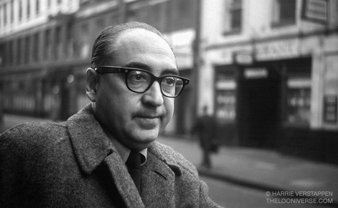
 Saul Bass


Saul Bass was an American graphic designer and academy award winning filmmaker, he was best known for his design of motion picture title sequences, movie posters, and logos  for major corporate companies. During his busy career he worked for some of Hollywood's biggest filmmakers, such as Alfred Hitchcock and Otto Preminger. Bass’s posters, however typically simple, his designs visually communicated essential elements of the film. One of his most recognisable quotes was "Design is thinking made visible." which speaks volumes about his work and how he connected his ideas in his head and made them come alive. He was born in New York on the 8th of may 1920 and  later died on the 25th of April 1996 (aged 75). 

Bass's work all has a lot in common such as the colours that he typically uses (red, white, black and orange). These colours work harmoniously together each making the other bolder. He also uses a lot of small shapes to build up an entire image, he does this using sharp straight lines or curved lines, but he rarely uses them together in the same part of an image. 


Saul Bass 6


                                            Saul Bass 

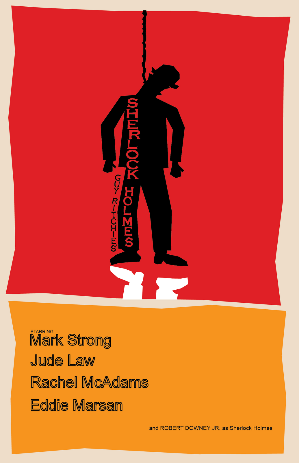
  • The colours that are used are typical Saul Bass (red, black,white and orange).
  • The shape of the man  is very structured and powerful which intern sends a strong message.
  • White feet at the bottom are used as a shadow,although it does not make the image 3D, also because he has swapped the feet around so that it is not a mirror image.
  • The lines are blunt and sharp which make it easier to differentiate between the  objects

Saul Bass 5


 Saul Bass


  • This poster consists of a dog made up of straight lines and corners which comes across quite harsh.
  • With the black colour he pinpoints the most important details such as the eyes and the nose.
  • The ball is the only part of the poster that has a rounded shape which other than it being black makes it bold.
  • As a Saul Bass tradition the writing is the common font and colour that he uses (white) 


saul bass 4


Saul Bass


  • Saul bass uses long white rectangles in this poster to create the twister he alternates the thickness of each end to create curves down the outside of the overall shape.
  • The colour red compliments the white well and creates crisp contrast lines.
  • The black writing (TWISTER) looks as if it has been stressed which adds texture and also relates to the twister theme.

Saul bass 3


                                              Saul bass 


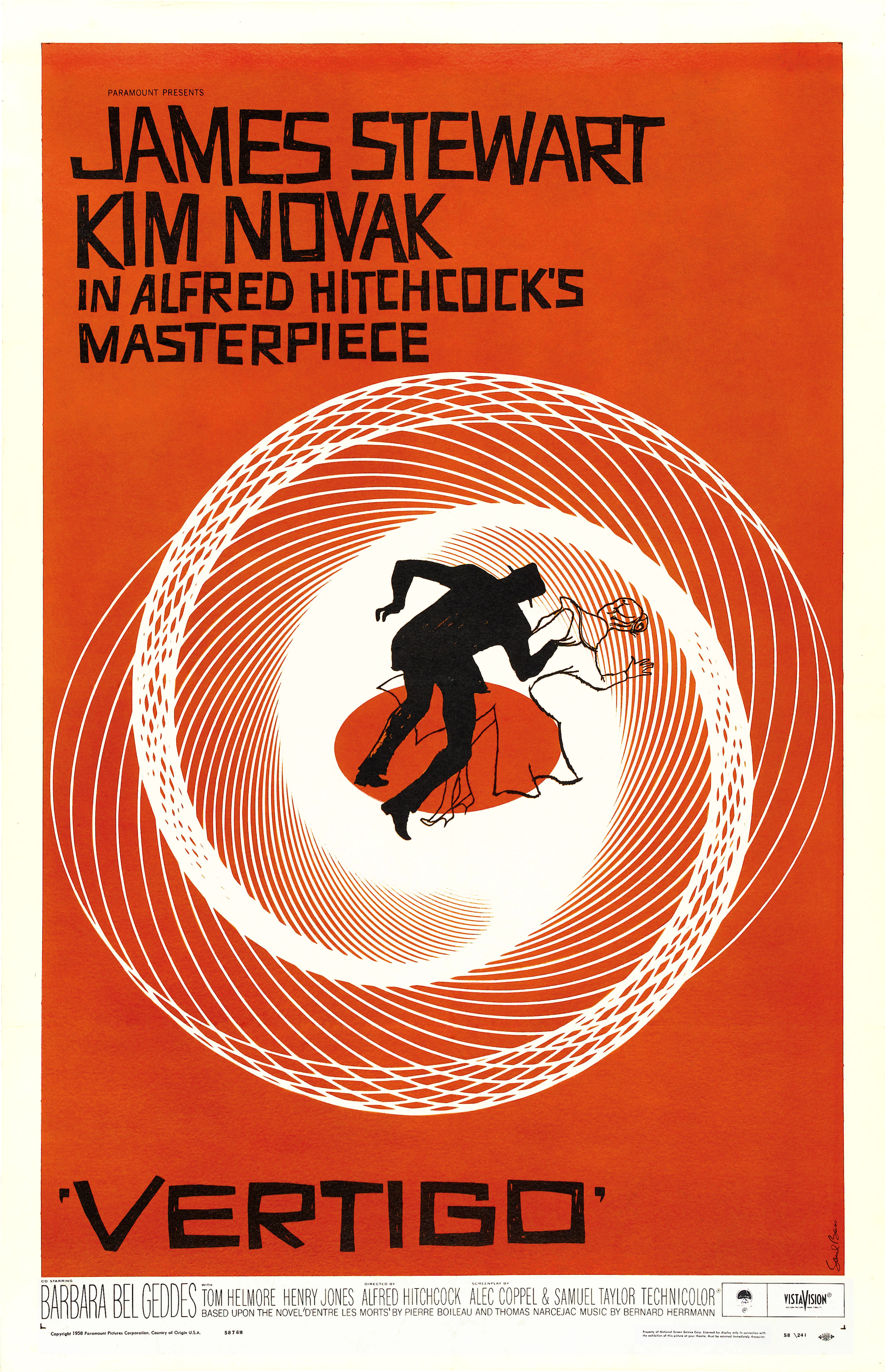
  • This vertigo poster is quite different to his other work because the white is used in in the actual image instead of just being the titles colour.
  • Saul uses lines to build up the soft white, gradually resulting in a solid area of white used as a backdrop for the black silhouettes.
  • The swirl like pattern consists of precision built lines spaced apart that gradually get closer together, which also creates a blurred/faded effect.
  • The man is all black and the woman only an outline, which allows the woman's body to take all of the patterns and colours in  resulting in her almost fading away, thus making the mans body bolder.


Saul bass 2


                                          Saul Bass

  • Saul bass uses his trademark trio of colours in this poster.
  • The phone has shading on it created by lines of red this is contrasting with the black. 
  • Bass also uses red to shape the phone and give it a 3D composition.
  • The two tones black and red compliment each other well, by creating a dynamic difference that works seamlessly well. 
  • A pattern in Saul's work is the font and colour used for writing on his posters it is widely used throughout his artwork.

saul bass 1


                                    Saul Bass 

  • Saul Bass is recognised easily because of his iconic style which is depicted here, as he often uses bold shapes. 
  • Demonstrated in this picture and many of his others, Saul uses a very limited colour pallet, mostly consisting of (black,red,white and orange).
  • Saul here uses the background lines of colours to divide sections of the bird, this allows the viewer to review each part precisely. It could also be a metaphor for thanks"killing".
  • The image is 2D resulting in limited texture.
  • Bass uses light and dark tones here to show the turkey, he used black on bright orange which shows the sharp transition and line.