Saul bass

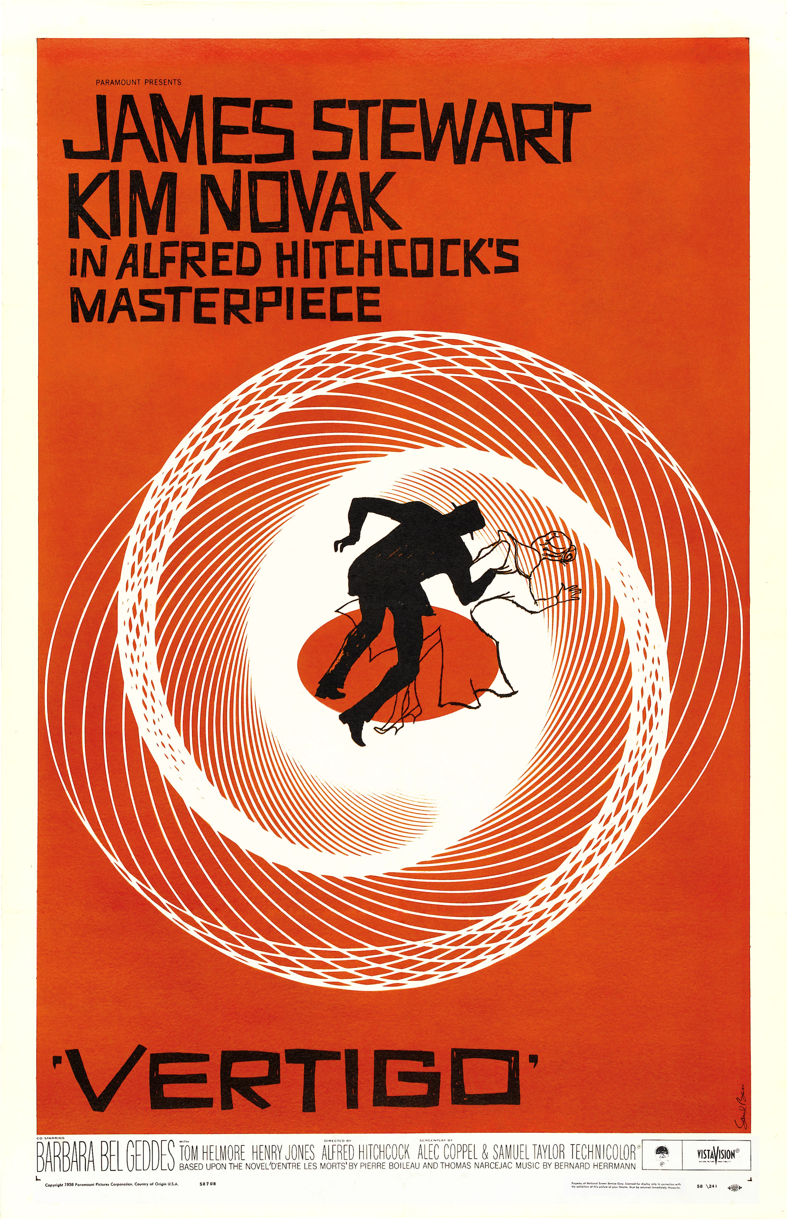
- This vertigo poster is quite different to his other work because the white is used in in the actual image instead of just being the titles colour.
- Saul uses lines to build up the soft white, gradually resulting in a solid area of white used as a backdrop for the black silhouettes.
- The swirl like pattern consists of precision built lines spaced apart that gradually get closer together, which also creates a blurred/faded effect.
- The man is all black and the woman only an outline, which allows the woman's body to take all of the patterns and colours in resulting in her almost fading away, thus making the mans body bolder.
No comments:
Post a Comment